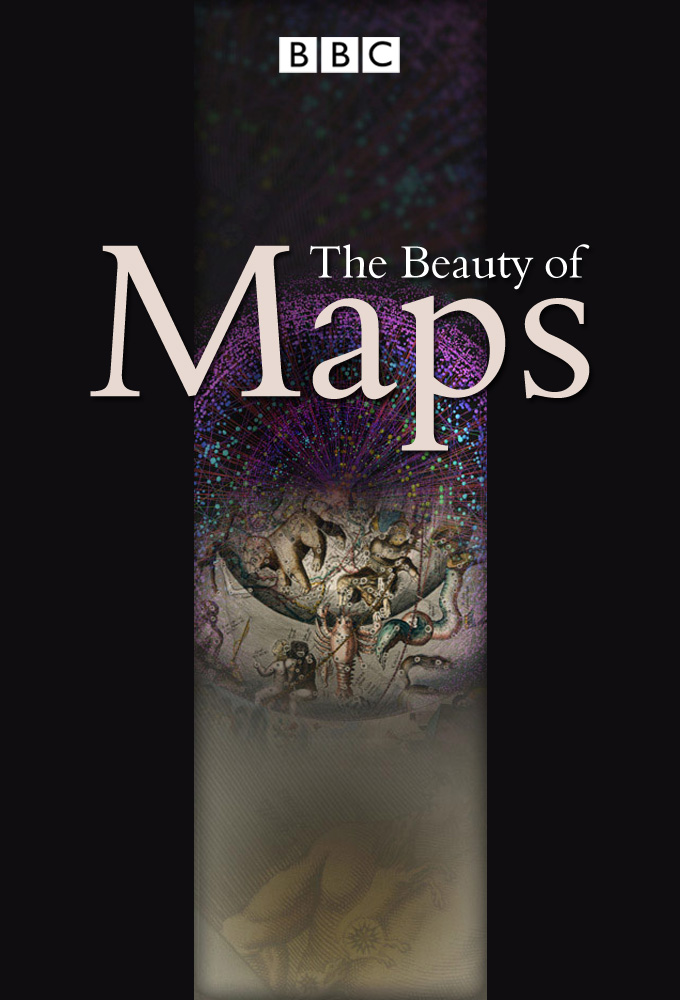
The Beauty of Maps
Non notée
Année : 2010
Nombre de saisons : 1
Durée moyenne d'un épisode : 30 minutes
Genre(s) : Documentaire
Documentary series charting the visual appeal and historical meaning of maps. The British Library is home to a staggering 4.5 million maps, most of which remain hidden away in its colossal basement, and the programme delves behind the scenes to explore some amazing treasures in more detail
Saisons

Saison 1
Épisodes
Choisissez votre saison au dessus et découvrez les épisodes qui vous attendent !
Épisode 1 - Medieval Maps - Mapping the Medieval Mind
19 avril 2010
The Hereford Mappa Mundi is the largest intact Medieval wall map in the world and its ambition is breathtaking - to picture all of human knowledge in a single image. The work of a team of artists, the world it portrays is overflowing with life, featuring Classical and Biblical history, contemporary buildings and events, animals and plants from across the globe, and the infamous 'monstrous races' which were believed to inhabit the remotest corners of the Earth. The Mappa Mundi, meaning 'cloth of the world', has spent most of its long life at Hereford Cathedral, rarely emerging from behind its glass case. The programme represents a rare opportunity to get close to the map and explore its detail, giving a unique insight into the medieval mind. This is also the first programme to show the map in its original glory, revealing the results of a remarkable year-long project by the Folio Society to restore it using the latest digital technology; the map has a chequered history. Since its glory days in the 1300s it has languished forgotten in storerooms, been dismissed as a curious 'monstrosity', and controversially almost sold. Only in the last 20 years have scholars and artists realised its true depth and meaning, with the map exerting an extraordinary power over those who come into contact with it. The programme meets some of these individuals, from scholars and map lovers to Turner Prize-winning artist Grayson Perry, whose own work, the Map of Nowhere, is inspired by the Mappa Mundi.
Épisode 2 - London: City Maps - Order Out of Chaos
20 avril 2010
This is the story of three maps, three 'visions' of London over three centuries; visions of beauty that celebrate but also distort the truth. It's the story of how urban maps try to impose order on chaos. On Sunday 2 September 1660, the Great Fire of London began reducing most of the city to ashes, and among the huge losses were many maps of the city itself. The Morgan Map of 1682 was the first to show the whole of the City of London after the fire. Consisting of sixteen separate sheets, measuring eight feet by five feet, it took six years to complete. Morgan's beautiful map symbolised the hoped-for ideal city. In 1746 John Rocque produced at the time the most detailed map ever made of London. Like Morgan's, Rocque's map is all neo-Classical beauty and clinical precision, but the London it represented had become the opposite. In engravings of the time, such as Night, the artist William Hogarth shows a city boiling with vice and corruption. Stephen Walter's contemporary image, The Island, plays with notions of cartographic order and respectability. His extraordinary London map looks at first glance to be just as precise and ordered as his hero Rocque's but, looking closer, it includes 21st century markings such as 'favourite kebab vans' and sites of 'personal heartbreak'.
Épisode 3 - Atlas Maps - Thinking Big
21 avril 2010
The Dutch Golden Age saw map-making reach a fever pitch of creative and commercial ambition. This was the era of the first ever Atlases - elaborate, lavish and beautiful. This was the great age of discovery and marked an unprecedented opportunity for mapmakers who sought to record and categorise the newly acquired knowledge of the world. Rising above the many mapmakers in this period was Gerard Mercator, inventor of the Mercator projection, who changed mapmaking forever when he published his collection of world maps in 1598 and coined the term 'Atlas'. The programme looks at some of the largest and most elaborate maps ever produced, from the vast maps on the floor of the Royal Palace in Amsterdam, to the 24 volume atlas covering just the Netherlands, to the largest Atlas in the world, The Klencke Atlas. It was made for Charles II to mark his restoration in 1660. But whilst being one of the British Libraries most important items, it is also one of its most fragile so hardly ever opened. This is a unique opportunity to see inside this enormous and lavish work, and see the world through the eyes of a King.
Épisode 4 - Cartoon Maps - Politics and Satire
23 avril 2010
The series concludes by delving into the world of satirical maps. How did maps take on a new form, not as geographical tools, but as devices for humour, satire or storytelling? Graphic Artist Fred Rose perfectly captured the public mood in 1880 with his General Election maps featuring Gladstone and Disraeli, using the maps to comment upon crucial election issues still familiar to us today. Technology was on the satirist's side with the advent of high-speed printing allowing for larger runs at lower cost. In 1877, when Rose produced his 'Serio Comic Map of Europe at War', maps began to take on a new direction and form, reflecting a changing world. Rose's map exploited these possibilities to the full using a combination of creatures and human figures to represent each European nation. The personification of Russia as a grotesque-looking octopus, extending its tentacles around the surrounding nations, perfectly symbolised the threat the country posed to its neighbours.
Vidéos
Oups aucune vidéo pour le moment... Revenez plus tard pour des aventures en images !

Aucun avis pour le momment...